- HOME
- ABOUT
-
Abstract
- ELEGANCE - {AVL}
- PIGEONS ON THE ISLAND - (AVL)
- CLOUD COVER - (AVL)
- NEW YORK GROOVE - {AVL}
- OCEANIC
- EVENT HORIZON
- ETHEREAL
- UNTITLED
- OUTBACK
- SATELLITE
- DESERT SOLITUDE
- DREAM GIRL
- WILD FLOWERS
- MIAMI SKIES
- WINTER SHADOWS
- FACE_01
- AUGUST IN THE CITY
- FACE_02
- UNTITLED ABSTRACT
- GOLD GIRL
- NEBULA 82
- STEPS
- OCEAN EYES
- RUBY ROADS
- ABOVE THE METROPOLIS
- SECRET GARDEN
- SKY DREAMS
- SUPERNOVA
- THE COAST IS CALLING
- BLOOM
- PRIMAVERA
- MCM SERIES
- OIL
- SKETCH
- PHOTO
Design Blog
French Artistic Ironwork
Recently I had the pleasure of working with a new client from France who contacted me in need of a new tee shirt logo for his business. After a couple emails exchanged across the pond, I finished up this project mixing classic bauhaus design with a bold typeface and an anvil as the centerpiece and focus.


Bauhaus Designs

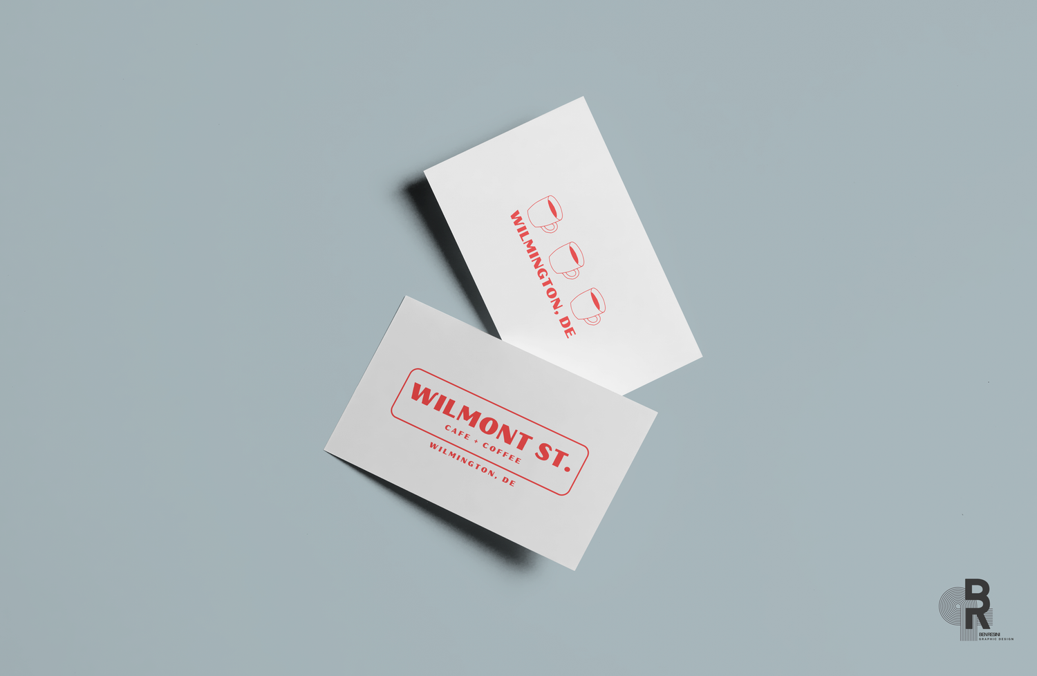
Business Card Mockup
My last design project involved using soft & cool tones as a backdrop to bold lettering.
I loved the design colors so I implemented my new business cards using similar backdrop.

Wilmont St. Cafe + Coffee - 2023
This quaint cafe + coffee shop was in need of a quick brand design package that provided graphics for their entire business. From the main logo on the large glass entrance to their coffee cups, the design needed to reflect the small yet sophisticated cafe offering small batch roasts for passerby's.

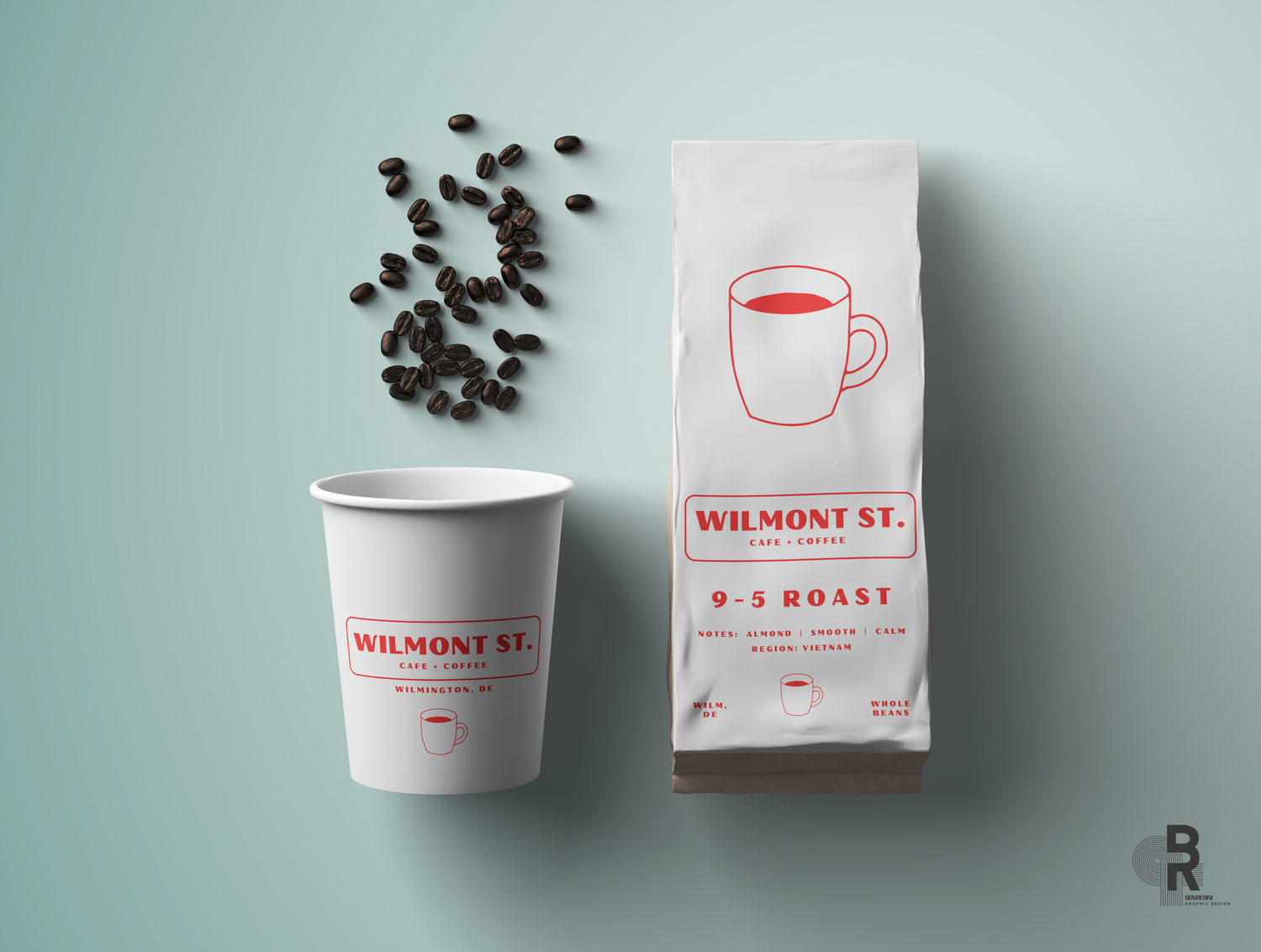

Clean + consistent design
These small individually owned coffee shops are getting fewer to find these days. The owners wanted a clean and consistent design that was impactful but not flashy. The goal was to blend a nostalgic look to shopfront glass front while keeping the designs minimal and modern.


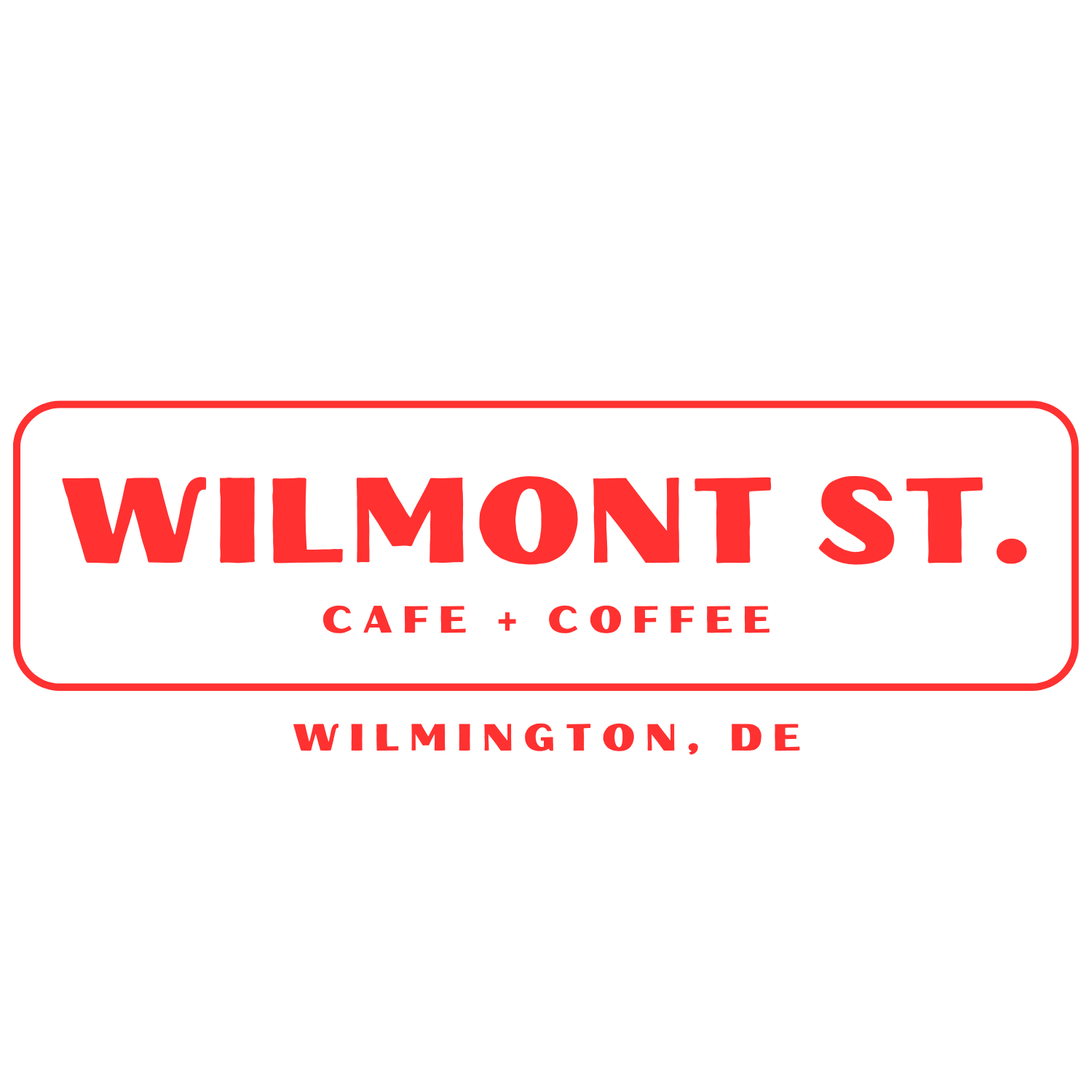

Crisp Colors against soft tones
After our initial call I had a good understanding of how the owners wanted to display their brand visually. I used a simple, yet nostalgic typeface in bold red set against a brilliant white background, providing just the information needed and no clutter.

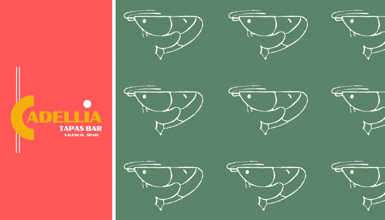
Cadellia Tapas Bar - 2024
A lovely Tapas Bar in need of a complete graphic design makeover from logo to menu. Inspired by familiar retro colors of the 1970's, these designs needed to blend modern branding with classic visuals.

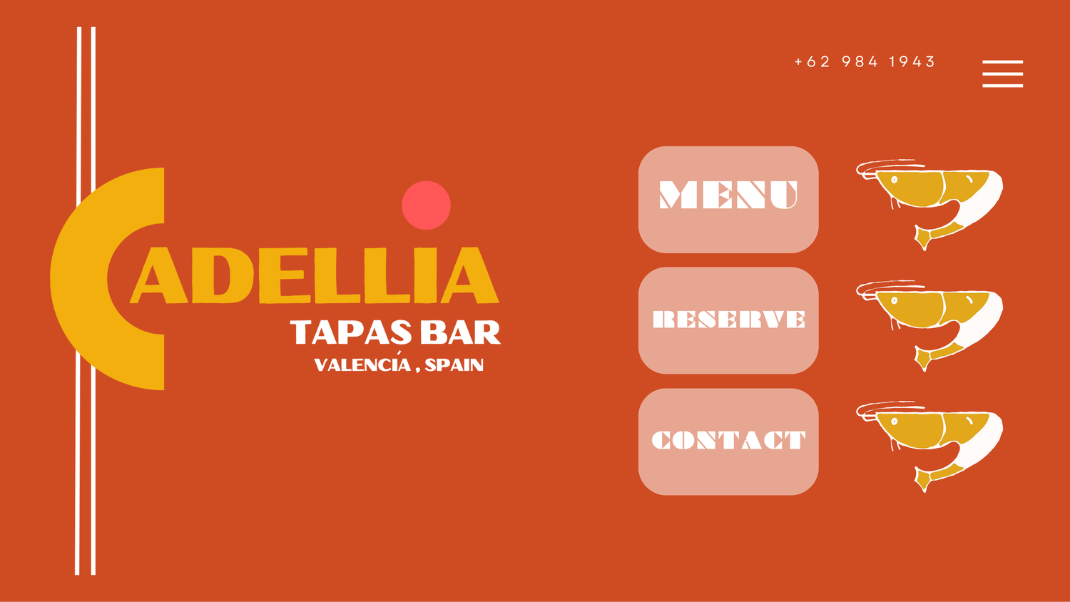
This brand identity package included a consistent design theme that reminisced of the stylish & "posh" cafe's along the Spanish coastline.
I combined a bold typeface for the main logo and only included the necessary points of interest on the website landing page.

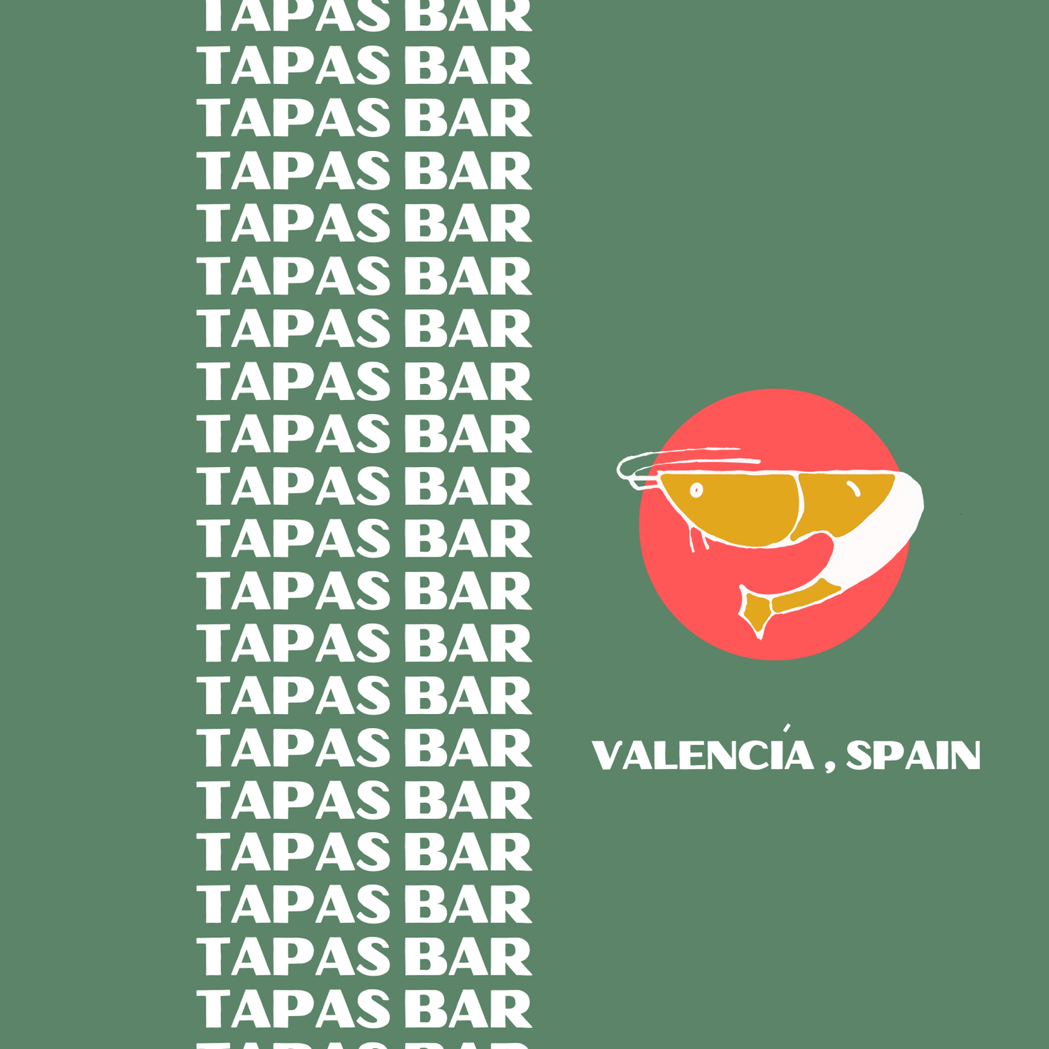

For the graphic I wanted to design something simple, yet fun & relevant to the brand. I mocked up a few shrimp sketches and decided on a single graphic repeated across a standardized color scheme.


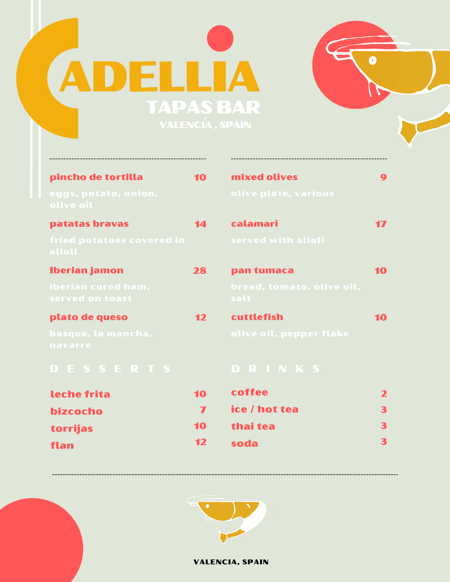
The menu design mirrored the general theme of the logo, with typeface inspired from the 1970's with corresponding color schemes.
The final design package included multiple designs all following consistent color and typeface schemes, reinforcing brand recognition. Multiple file types are included for easy implementation into any marketing stationary.